Flexbox is a part of CSS that provides a more efficient way to layout, align, and distribute space among items in a container. It helps us when we have those silly block elements that can be hard to tell them to do exactly what we want.
🎯 Learning Goals
Explain the difference between a parent and child, and a direct child
Apply Flexbox to containers to achieve a desired layout
📗 Technical Vocabulary
Child
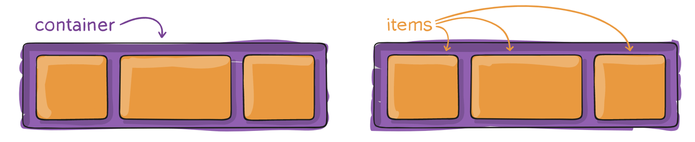
Container
Direct child
Item
Parent
Main axis
Cross axis
Flexbox IRL
Flexbox is used all over the internet. It’s a little tough to learn, but once you know it, it makes your life a lot easier! That’s why it is so popular among front-end developers.
Here are just a few popular pages that use Flexbox:
Netflix uses Flexbox to organize its rows of movies and TV show thumbnails, making it easy to scroll through categories on the homepage
Airbnb uses Flexbox to lay out its property listing cards, aligning photos, prices and ratings in a clean, responsive grid for its users
Spotify uses Flexbox on its web player to arrange playlists, album art, and navigation elements so everything is neatly aligned across different screen sizes
Parents and Children
Before we start working with Flexbox, we need to make sure we are referring to elements and their relationship to other elements correctly. We need to be careful about the CSS rules we apply to a parent element vs. those to a child element. A parent element wraps other elements, and a child is nested inside the parent. We will also refer to parents as containers, and children as items.
Let’s look an some HTML to make sure we are all on the same page:
In the code above, the section is the parent/container, and the 3 articles are all children/items because they are directly nested inside of that section. An article is an element that contains content specific to itself. The article element could be a blog post, a news article, and any content of a webpage that could standalone.: Source.
Let’s look at one more example:
<section class="container">
  <article class="item-in-container">
    <h2>Title of Article 1</h2>
  </article>
  <article class="item-in-container">
    <h2>Title of Article 2</h2>
  </article>
  <article class="item-in-container">
    <h2>Title of Article 3</h2>
  </article>
</section>
In the code above, we now have these h2 elements nested inside of the articles. It’s important to know that h2 is not a child of the section. It is technically a grandchild of the section, and a child of article. In other words, the articles are direct children of section, just as h2 is a direct child of article The idea of direct child is really important to understand as we work with Flexbox.
In the CSS file of the flexbox-applied project, what element(s) is the declaration display: flex; applied to? Is that a parent or child?
💼
Takeaways
To use Flexbox, we need a container element with one or more items inside of it
The declaration display: flex; should be applied to the container
The container (parent) won’t be affected, but the layout of the items (children) may change
Flexbox Terminology
Now that we know how to use Flexbox, let's learn some vocabulary that will help us control it! Think of Flexbox like a conveyor belt! Items line up and move along a path. That path has a name.
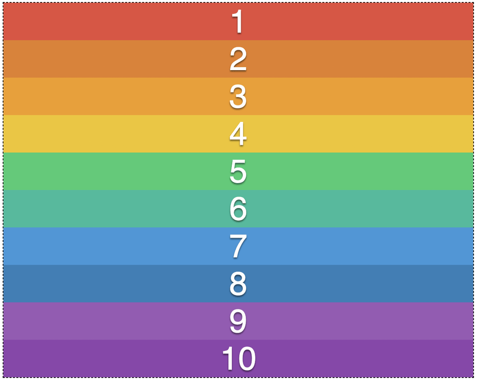
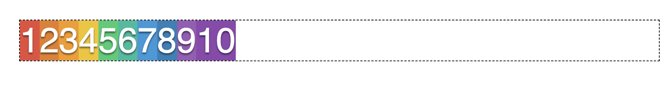
The Main Axis
The main axis is the direction Flexbox uses to line up your items. By default, the main axis runs left to right, which is why your items snapped into a row when you added display: flex.
The Cross Axis
The cross axis runs perpendicular to the main axis, meaning it always goes in the opposite direction. If your main axis is running left to right (a row), your cross axis runs top to bottom. If your main axis is running top to bottom (a column), the cross axis runs left to right. You don't need to set the cross axis yourself. It just exists automatically as the “other direction.”
Why does this matter? A lot of other Flexbox properties, like how you center items or space them out, depend on which axis you're targeting. Knowing the difference between the main axis and cross axis will help those properties make a lot more sense as we keep going!
You can change the direction of the main axis using the flex-direction property. This is one of the most useful tools in Flexbox because it lets you choose whether your items line up in a row or stack in a column. You set flex-direction on the parent container, just like you did with display: flex, and the children will automatically adjust. There are two values you'll use most often:
.container {
  display: flex;
  flex-direction: row; /* default — items line up left to right */
}
.container {
  display: flex;
  flex-direction: column; /* items stack top to bottom */
}
If you add display: flex to a container but don't write a flex-direction at all, it will behave as row automatically! You only need to write it out when you want to switch to column.
Can you explain the differences between space-between, space-around, and space-evenly? Consider asking an AI tool to provide an explanation that contrasts these justify-content values.
There is more to learn about Flexbox, but we can do a lot with what we know. It will take a while to get used to; remember to use your Dev Tools and use that borderproperty to help you understand what space each element is taking up.
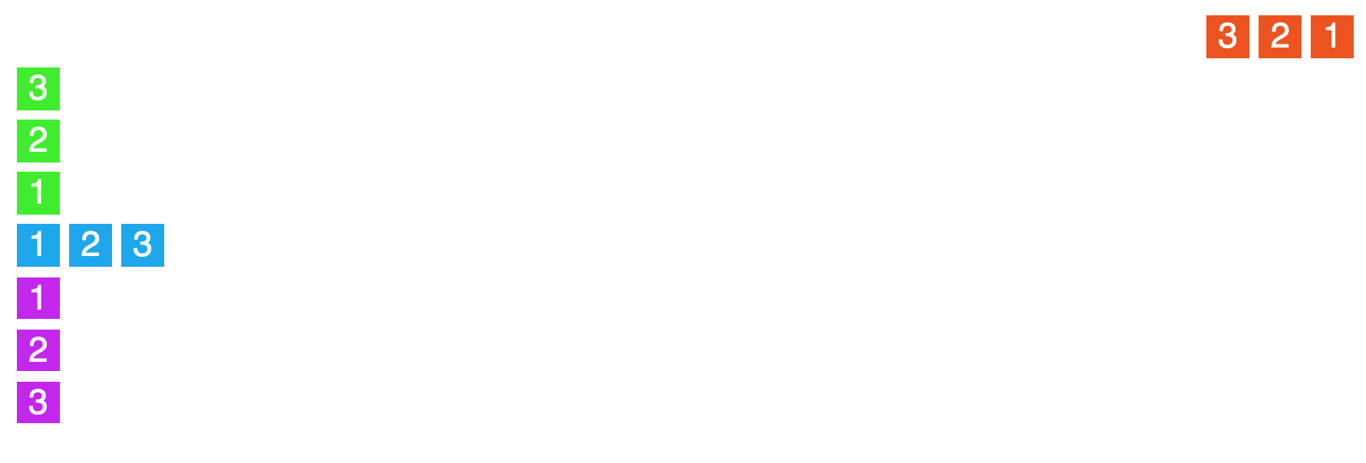
Your job will be to update the CSS (you'll probably need to add some classes on some HTML elements, too!) so the outcome looks like the screenshot below, but first, take some time to jot down some notes about how you will approach this.
Hint 1
To move the red group of boxes, the green group of boxes, the blue group of boxes, and the purple group of boxes, use the following code in index.htmlto group the boxes by color:
<section class="red-g">
// The existing code for the red boxes
</section>
<section class="green-g">
// The existing code for the green boxes
</section>
<section class="blue-g">
// The existing code for the blue boxes
</section>
<section class="purple-g">
// The existing code for the purple boxes
</section>
Together,
<section class="boxes">
      <section class="red-g"> // Grouping the red boxes
        <article class="red">1</article>
        <article class="red">2</article>
        <article class="red">3</article>
      </section>
      <section class="green-g"> // Grouping the green boxes
        <article class="green">1</article>
        <article class="green">2</article>
        <article class="green">3</article>
      </section>
      <section class="blue-g"> // Grouping the blue boxes
        <article class="blue">1</article>
        <article class="blue">2</article>
        <article class="blue">3</article>
      </section>
      <section class="purple-g"> // Grouping the purple boxes
        <article class="purple">1</article>
        <article class="purple">2</article>
        <article class="purple">3</article>
      </section>
    </section>
More Practice
Scrimba offers a free course that is under an hour long. This might be a great watch if you’re struggling to understand Flexbox!
Can’t get enough of Flexbox Froggy? Try out Flexbox Defense.
📝
Practice #2 | Upgrade Your Nav Bar with Flexbox
Back in the CSS Syntax lesson, you built a horizontal nav bar using display: inline-block. Now let's upgrade it using Flexbox, which gives us the same result with more control and less code!
In your About Me site's CSS file, find the rule where you set nav li to display: inline-block and delete it.
Add display: flex to your nav ul instead.
Play around with padding on your nav a to give your links some breathing room.
Try adding justify-content: center or justify-content: flex-end to your nav ul. What changes?
Now add padding to your nav ul to give the whole bar some breathing room. How is that different from adding padding to nav a (like step 3)?
🌶️ Click here for a Mild Challenge!
Professional nav bars change when you hover over them! If you haven't already, research how to use the :hover pseudo-class to make the background color or font color of each link change when a user hovers over it.
🌶️🌶️ Click here for a Medium Challenge!
Right now your nav links are probably bunched toward one side of the bar. Can you use justify-content to space them out evenly? Explore the values space-between, space-around, and space-evenly. What is the difference between the three?
🌶️🌶️🌶️ Click here for a Spicy Challenge!
On a small phone screen, a horizontal nav bar can feel cramped. A thoughtful developer would switch the layout to a vertical stack on smaller screens.
In your nav ul, add flex-direction: column and align-items: center. This makes your nav stack vertically by default, which is your mobile layout.
Now write a media query that targets screens 600px or wider using min-width. Inside it, set flex-direction: row and bring back your justify-content value. This is your desktop layout.
Test it by shrinking and expanding your browser window!