Understand the difference between inline and block elements
Use margin and padding to achieve ideal breathing room around elements
Control the layout of a page using height, width, and an understanding of the box model
📗 Technical Vocabulary
Box Model
CSS Property
Block Elements
Inline Elements
Margin
Padding
🌤️
Warm-Up
What is your favorite CSS property and HTML element so far? And why?
Block vs. Inline Elements
You might notice that some HTML elements behave a little differently in a layout than others. Some elements make the content stack, while others let content sit next to each other. What’s that about?
This is an important difference:
Block elementsstack on top of each other. Each one starts and ends on its own line. Most elements are block elements. When you write two paragraph <p>, elements in your HTML file, they will show up on different lines, right? That is because they are block elements. Other block elements we’ve worked with:
h1
h2 (and h3 - h6)
div
Inline elements fit within the flow of text without breaking the line.
a
em
strong
button
input
When looking at the HTML, you also notice that it’s common for inline elements to be written on the same line of code, nested inside of a parent, which is the same as a wrapping element.
<p>
  "I was taught that the way of progress was neither swift nor easy." — <strong>Marie Curie</strong>
</p>
✏️
Try-It | Inline vs. Block
Open this CodeSandbox and fork it to work through the Try-Its in this lesson! Let's take a couple minutes to see this in action to make sure we have an understanding.
Start by copying this table on to a piece of paper:
HTML ELEMENT
BLOCK OR INLINE?
h1
ㅤ
h2
ㅤ
p
ㅤ
em
ㅤ
code
ㅤ
button
ㅤ
span
ㅤ
label
ㅤ
input
ㅤ
Now, look at the elements in your Sandbox and fill in the table based on your observations of the HTML elements.
Overriding the Default Display
With CSS, we have the power to override an elements default state of inline or block with the display property.
Here’s an example:
button {
  display: block;
}

p {
  display: inline;
}
🔎
Explore | Override with CSS
Continue working in the same Sandbox as before!
Copy and paste the CSS rule for button from the snippet above into the CSS file of your CodeSandbox. What happened when you pasted in the rule for the buttons?
Copy and paste the CSS rule for p from the snippet above into the CSS file of your CodeSandbox. What happened when you pasted in the rule for paragraphs?
Before moving on, go ahead and comment out those two new CSS rules. To do this quickly, highlight the lines and use the shortcut Cmd+/ or Ctrl+/. We’ll stick with the default display properties for now!
In this CSS lesson, we’ll go a step further with layout design. Understanding the difference between block and inline elements, and being able to change them, allows us to control the layout of a page a little more.
CSS Box Model
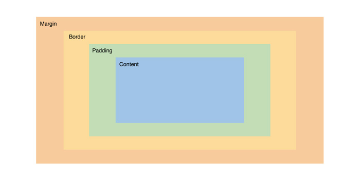
Next, let’s talk about something called the Box Model. Each element is treated like a rectangular box. Whether it’s a paragraph, an image, or a button, each one takes up space, and how that space is calculated follows a very specific structure. CSS leverages the box model to control layout and design.
That structure includes:
Content – the actual stuff inside (like text or images)
Padding – space inside the box, around the content
Border – the edge of the box
Margin – space outside the box, separating it from other elements
The image to the right helps us visualize each piece (and the colors match those in the Chrome DevTools, which we’ll go over in just a bit!).
When you hover over elements in the browser when you are in inspect mode, you may have noticed that there are flashes of blue, green, orange, and sometimes yellow. Chrome didn’t just put different colors in there for fun; each color has a meaning.
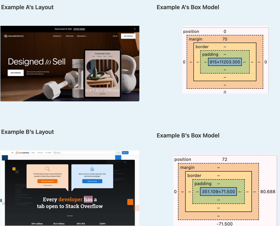
Up until now, we haven’t used CSS to create space or “breathing room” between elements. Let’s look at Olivia Dean's Instagram account for some examples:
🔎
Explore | Box Model
Go to your favorite site and open the Chrome Dev Tools. Right-click anywhere on the page and select “Inspect” or press Cmd + Option + I (Mac) or Ctrl + Shift + I (Windows).
💡
Did You Know? Chrome Developer Tools (often called DevTools) are built-in tools in the Google Chrome browser that let you see and experiment with the code behind any website. You can inspect HTML, tweak CSS in real time, view layout spacing like margins and padding, debug JavaScript, and so much more — all without affecting the live site for anyone else.
Hover over elements on the page. Where do you see margin and padding being used?
Examples here!
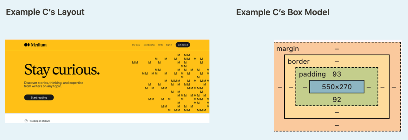
See Example A here, see Example B here, see Example C here.
🤖 AI Connection
Craft a prompt asking an AI tool to explain the difference between margins and padding. Did you learn anything new?
Padding
Padding creates space between the content and the border. Most elements don’t have any by default, so a lot of the time, our content can look squished. We use the padding CSS property to add what we call “breathing room” between a piece of content and its border.
Looking at Instagram’s profile header, the following CSS rule is applied to the header section:
We can also see this by using the dev tools to inspect. The part highlighted in blue is the content, and the part highlighted in green is the space created by the padding rule.
In this example, Instagram uses padding: 20px, which means: 20px padding on all four sides (top, right, bottom, and left). This creates consistent “breathing room” around the content inside the container. There are several ways we can tell CSS that we want to add padding. Here are some common patterns:
/* Same padding on all four sides */
.element {
  padding: 20px;
}

/* Different padding on each side (top, right, bottom, left) */
.element {
  padding: 10px 20px 15px 5px;
}

/* Vertical and horizontal padding (top/bottom, left/right) */
.element {
  padding: 10px 20px;
}
When you don’t specify which side of the element you want padding on, all four sides will get that amount of padding.
If you want different sides of the element to have different amounts of padding, you can write it out individually:
In the code snippet above, the element would have 10px of padding on the bottom and no padding on the top. Both sides - right and left - would have 30px of padding.
✏️
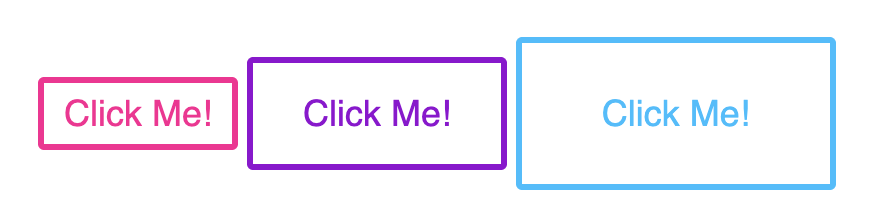
Try-It | Padding
Open your CodeSandbox from earlier. Read through the HTML and CSS provided to make sure you understand what you're starting with.
Re-create the image below using the HTML and CSS provided as a starter kit. Use the colors deeppink, darkviolet, and deepskyblue.
Margin
Similar to padding, margin is a CSS property that helps us control the spacing of elements. The difference between the two is, margin creates space outside the border, between other elements, whereas padding is within the border. Instagram uses margin to create space between the profile header section and the content below it. Notice the orange part in the dev tools:
Instagram (owned by Meta/Facebook) uses Atomic CSS. Instead of one class like .header with many properties, they use many tiny classes that each do one thing. That's why you see header.x1qjc9v5.x78zum5... with all those random class names.
Each class handles a single CSS property (like one for padding, one for margin, etc.). The names are auto-generated and optimized for computers, not humans!
Don't worry—you don't need to understand these class names. Focus on learning what margin and padding do. When you build your own sites, you'll use simple, readable names like .header or .profile-section.
❌ Remember not to follow this practice (Atomic CSS) in your own work!
Notice the orange part highlighted in the browser’s developer tools—that’s the margin! The margin values 0px 0px 44px mean:
0px margin on the top
0px margin on the right and left
44px margin on the bottom
The 44px bottom margin creates the visual space (gap) between the profile header and the posts/content that appear below it. This space is outside the element’s border and pushes the other elements away.
✏️
Try-It | Margin
Open the CodeSandbox from earlier. Read through the HTML and CSS provided to make sure you understand what you're starting with.
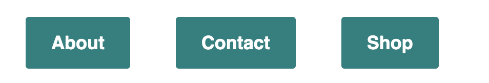
Re-create the image below using the HTML and CSS provided as a starter kit. You'll need both margin and padding! Use the color #00807f.
Default Browser Behavior
One thing to note - you may have noticed that the browser provides some “built-in” margin and padding, just like h1 elements appear larger and bolder than content in a p element. The browser does this to be helpful to developers who aren’t going to use any CSS (think Craigslist), but it can become bothersome for developers like us, who really want to customize the look and feel of our pages. So, at the top of every CSS file we write from here on out, we should include the following rule:
The * means: apply this rule to ALL elements. box-sizing: border-box is a little complicated; it means that if borders are used, they will be counted as the content. If you are doing very specific work with margins, where it would be obvious if you were off by 1 tiny pixel, this would be very important.
Sizing Images
Many times, the photos we bring in will not be the exact size we want it to be for our site. We can use the width and height properties to handle this.
We will almost always want to preserve the ratio of the image, so we should give either width or height, but not both. Once we set the width or height, the other dimension will be determined by the ratio of the original image.
If you want to give both width and height for some reason, you may need to apply the object-fit property. This might come in handy if you want to display a row of photos of the same height and width, but which all started off in various sizes.
Look at the two images of Soledad Antelada Toledano below, then look at the code that was used to style them:
The object-fit property on the .correct-ratio class fixed the distorted ratio for us. We did lose some of the photo (on the sides), but with most things, we want to maintain the original ratio.
✏️
Try-It | Sizing Images
Open the CodeSandbox from earlier. Find 3 photos from Pexels and create image tags for each of them in your CodeSandbox. Get a mix of images that are vertical and horizontal.
Style the photos so they appear to be the same size, and make sure they aren't squished!
📝
Practice| CSS: Layout
Now that you understand the power of CSS layout and the box model, it's time to enhance your About Me portfolio with these new skills! Your portfolio already has content, but now you can make it visually appealing with proper spacing and layout.
Open your About Me project and use your new knowledge of margin, padding, and the box model to improve its appearance and organization.
Ideas of what you could update:
Create Breathing Room - Apply appropriate margin and padding to major sections of your page. Make sure elements aren't crowded together and that there's clear visual separation between different content areas.
Image Improvements - Properly size any images on your page, ensuring they maintain their correct aspect ratio. Consider using percentage widths for responsive sizing.
Remember: Before adding any new CSS, consider adding the CSS reset at the top of your stylesheet.
This will remove the browser's default spacing and give you complete control over your layout.
Mild Challenge 🌶
If you have navigation links, ensure they have consistent and comfortable spacing between them using margin and/or padding.
Medium Challenge 🌶🌶
Add or edit a profile photo that's styled as a circle using border-radius, and position it with appropriate margins so it integrates well with your text content.
Spicy Challenge 🌶🌶🌶
Add a hover effect to some of the elements on your About Me page.