Welcome to Design
Gestalt Psychology describes how humans are wired to see patterns and make sense of their surroundings by grouping things together. Designers use this to their advantage by applying six laws, or principles, to organize content in ways that feel natural and intuitive to users. Today we'll look at three of them!
🎯 Learning Goals
- Identify design principles in applications
- Identify color choice in applications and create palettes with appropriate contrast
- Create wireframes taking design principles into consideration
Warm-Up
For today’s lesson, you’ll be diving into design, which is a part of the user interface and user experience, which we sometimes refer to as UI/UX. “Good” user interface and design may feel seamless to you as a user: that’s when you know developers have done a great job at creating technology with the user top of mind. Here’s an opportunity to discover firsthand how a poorly designed interface can make even the simplest tasks feel like a daunting challenge, head to userinyerface.com to experience “bad” user interface!
Design Principles
Law of Proximity
Elements next to each other tend to be grouped together. Even though this is made up of unrelated elements, we see a column on the left, a square to the upper right, and a short row on the lower right.

Law of Enclosure
Items that are enclosed in a border or with a background color tend to be grouped together. A figure will be perceived as separate from its background. A border provides a separation.

Law of Similarity
Elements that look similar will be perceived as part of the same form. Despite the similar scale and distribution of shapes, we see columns of squares and circles

Try-It | Laws of Design
Go to a few of your favorite websites. Find an example of each of the three laws we just learned about. Write it down in your journal!
Go to a few of your favorite websites. Find an example of each of the three laws we just learned about. Write it down in your journal!
Color
“Color is a powerful form of communication. We are so attracted to color and so repelled by it that even if the coolest design were presented to us, if we didn’t like the color, we wouldn’t like it at all.” - Joanne Chang, from Hack Design’s “Building Color Confidence”
Whether or not we consciously realize it, colors carry meaning. The exact meaning can be subjective and can be swayed by other design choices and context, but it is often heavily influenced by the culture someone grew up in. Therefore, it is important to be aware that colors can have very different connotations and associations based on different cultural traditions, countries, and religious beliefs. Take white, for example. White often symbolizes purity, fulfillment, and brightness. However, in some cultures it is more closely associated with death, is often used as a color of mourning, and is frequently used in funerals. One color, two vastly different meanings.
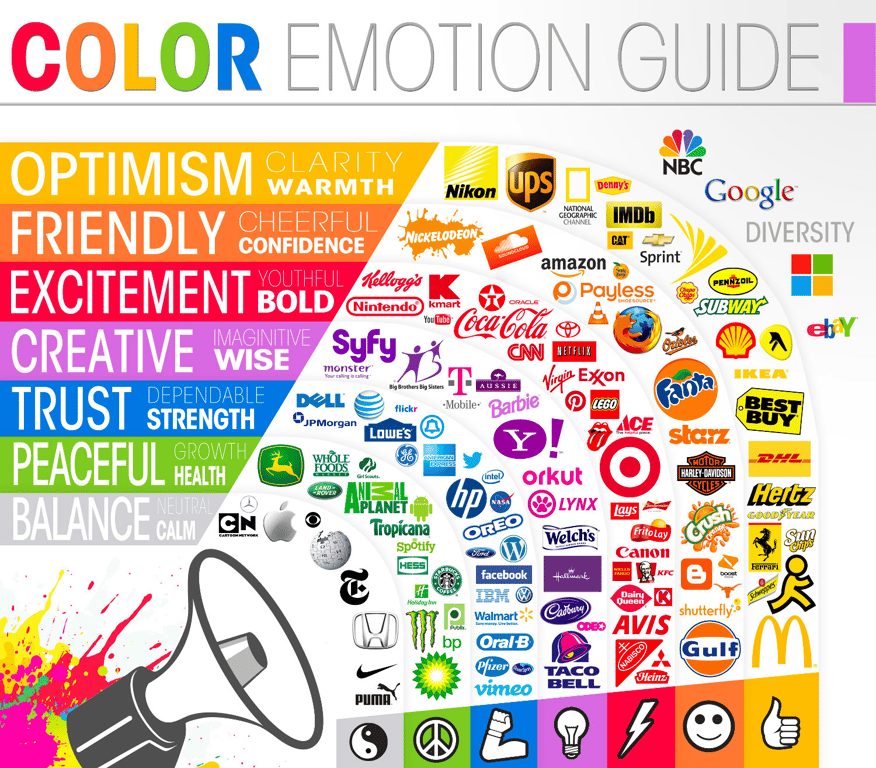
Emotions
There are three groupings that colors fall into: warm, cool, and neutral. The colors inside of these groups tend to share similar meanings: warm colors are generally positive and energetic, cool colors are calmer and relaxing, and neutral colors are more conservative.
Contrast
Contrast is the difference between two colors. You usually want a high contrast, but too much contrast might be alarming or unsettling. Black and white create the highest contrast possible. Usually, when you think you see black/white combinations on pages, it’s a very light grey and/or very dark grey.
It’s important to provide a contrast for your page to be pleasant, but it’s essential that you do so for users who may be colorblind or have limited vision. This is an awesome tool that allows you to enter two colors and get an analysis on if the contrast is acceptable.
Combinations
There are many ways we can choose to select colors. Let's explore some color combinations through a color wheel! Go to the Canva Color Wheel to learn about key color pairings.
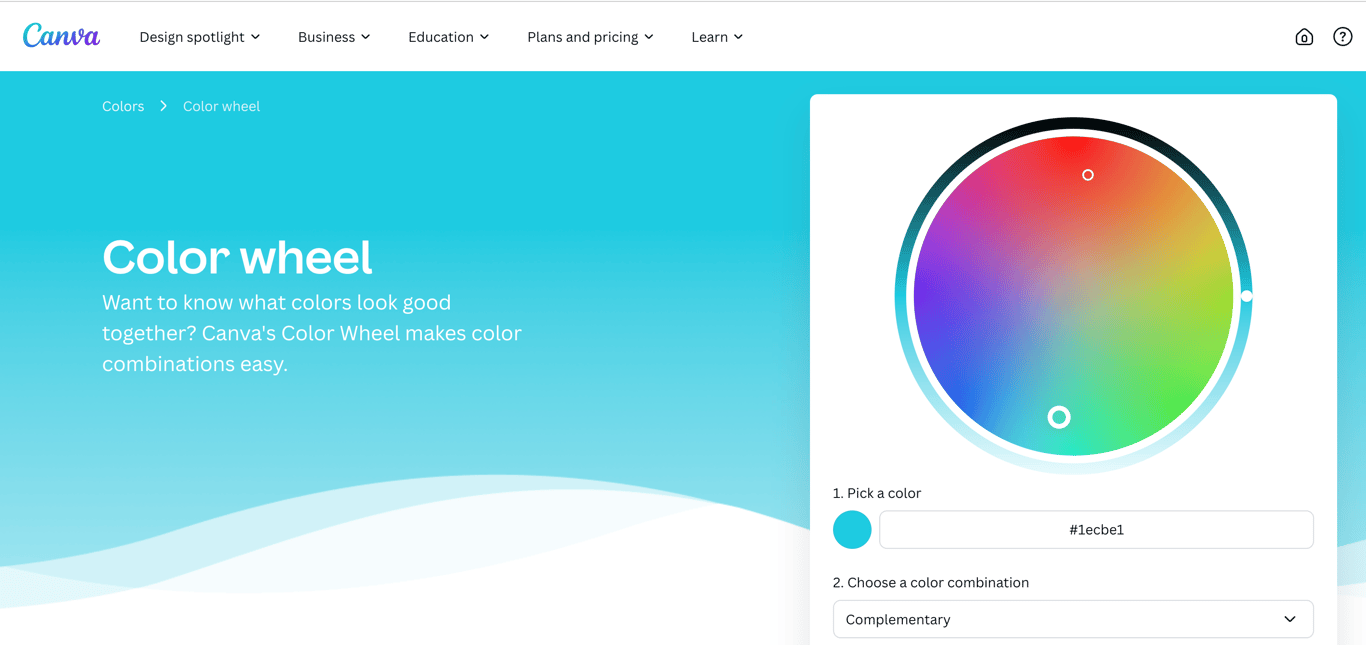
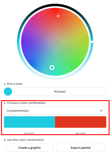
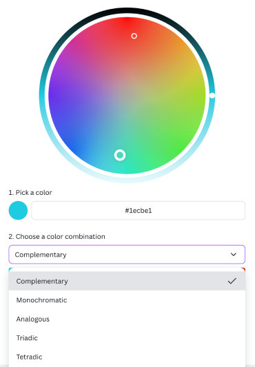
In the Canva Color Wheel, you can pick a color combination to learn about key color pairings in including Complementary, Monochromatic, and Analogous Colors.
As you play around with the color combinations, take note of these pairings:
- Complementary Colors: Two colors that sit directly across from each other on the color wheel. They complement each other and often have the most contrast, but that doesn't always mean they make for the nicest pairings
- Split Complementary Colors: Starts with one color and then instead of going straight across the color wheel to the complimentary color, go to either the left or right a couple of colors. This softens the contrast and often gives a nicer, more visually appealing pairing.
- Analogous Colors: Groups of colors that are close to each other on the color wheel. They have enough contrast to be clearly distinguishable from one another, but because they are very similar they form a harmonious group
Try-It | Colors
Using the Canva Color Wheel, generate color palettes and discuss the appeal of the color combinations you made.
Using the Canva Color Wheel, generate color palettes and discuss the appeal of the color combinations you made.
Questions to consider:
- Why do these colors go well together?
- How do the colors balance each other?
- What would you use this combination for?
Did You Know?
Check out Huemint, the AI color palette generator that uses machine learning to create unique color schemes for your brand, website or graphic.
Check out Huemint, the AI color palette generator that uses machine learning to create unique color schemes for your brand, website or graphic.
Note: Although using AI tools can be helpful in creating quick and unique color palettes, ensure that the output it is generating is aligned with the accessibility of your design.
Did You Know?
It’s important to note that front-end developers do not need to be design experts. In fact, on many teams, there is a designated person whose role is to design. A front-end developer’s role may just be to bring what that designer created to life. (And, if you like design, you may consider looking into UI/UX!) So, if selecting colors “isn’t your thing” - that’s ok! There are some awesome tools out there like Color Mind, Canva, Coolors and Color Hunt that can help you make a great choice.
It’s important to note that front-end developers do not need to be design experts. In fact, on many teams, there is a designated person whose role is to design. A front-end developer’s role may just be to bring what that designer created to life. (And, if you like design, you may consider looking into UI/UX!) So, if selecting colors “isn’t your thing” - that’s ok! There are some awesome tools out there like Color Mind, Canva, Coolors and Color Hunt that can help you make a great choice.
Designing With Accessibility Top of Mind
“You are not your user”
⬆️ This is a quote that is commonly used in the user interface / user experience world to remind developers to think beyond their own experiences when creating technologies. If we use our own abilities and biases as a starting point, we end up with products designed for people of a specific gender, age, language ability, tech literacy, and physical ability.
The false-consensus effect. Let’s talk about the psychology behind the previous quote “You are not your user.” What this phrase is describing is the false-consensus effect, which describes people's tendency to assume that others share their beliefs and will behave similarly in a given context.
Did You Know?
The false-consensus effect refers to people’s tendency to assume that others share their beliefs and will behave similarly in a given context. Only people who are very different from them would make different choices.
The false-consensus effect refers to people’s tendency to assume that others share their beliefs and will behave similarly in a given context. Only people who are very different from them would make different choices.
“A beautiful website that functions poorly for users with disabilities is like a beautiful skyscraper with only staircases connecting its floors.”
Colors
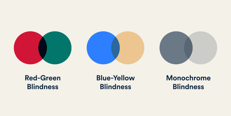
Many people with colorblindness are not able to differentiate certain colors from each other. When picking out your color combinations, keep in mind the potential color pairings that won't be easily distinguishable for individuals with colorblindness, such as red and green, yellow and light green, or monochrome blindness.
Text Size
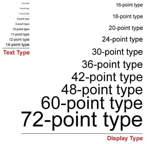
Ensure that your text is legible for those that have low vision and struggle to read small text. The standard text size for website design is
16px for body text.Links
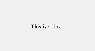
Links should be identifiable by underlining and making it a different color from the rest of the body of text. The standard color for links is typically blue because of its visibility on both white and black backgrounds. They should also take form of meaningful text, not URLs .
Wayfinding and Intuitive Design
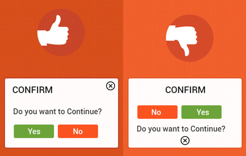
Think about the order in which you want users to interact with each element of your website design. Using visual hierarchy, lay out the elements in a way that guides the user's attention naturally, starting with the most important content and progressing to secondary and supporting information.
Inclusive Design
Inclusivity is the practice or policy of providing equal access to opportunities and resources for people who might otherwise be excluded or marginalized. Inclusive design focuses on building technology that is equally accessible to, representative of, and responsive to everyone. This means thinking beyond your own experience and considering users of all backgrounds, abilities, and identities, including people of different ethnicities and upbringings, people who aren't able-bodied, and people who aren't euro-typical.
Solving for One Can Extend to Many
Here's something that might surprise you: accessible design doesn't just help the people it was originally created for. When you design with one group's needs in mind, you often end up making something better for everyone.
Let’s think about a real-world example. The curb cut (the sloped ramp where a sidewalk meets the street) was designed for wheelchair users. But it also helps parents pushing strollers, delivery workers with carts, and skateboarders.
The same idea applies to technology. Some features we all use every day started out as accessibility solutions:
- Closed captions were created for the deaf and hard of hearing community, but now plenty of people use them to watch videos in a noisy cafeteria, a quiet library, or when they just forgot their headphones.
- High-contrast screen settings were designed for people with vision impairments, but anyone who's tried to read their phone screen in bright sunlight has been grateful for them too.
- The same goes for remote controls, automatic door openers, audiobooks, and more. They were all designed with a specific need in mind, but benefited a much wider audience!
The takeaway? Inclusive design isn't a limitation on your creativity. Designing for everyone often leads to smarter, more thoughtful solutions that make your work better across the board.
Mobile-First Design
Think about the last time you discovered a new app, brand, or artist. Did you find it on your laptop, or on your phone? Chances are, it was your phone! In fact, as of January 2026, over 50% of all internet traffic worldwide comes from mobile devices according to gs.statcounter.com.
As the name suggests, mobile-first design is an industry-standard approach where web designers start by designing for the smallest screen, then scale up to larger screens like tablets and desktops. It flips the old way of doing things, where people would design a full desktop site and then try to squish it down to fit a phone.
Designing for small screens isn’t just a technical decision, it actually makes you a better designer! When you only have a few inches of space to work with, you’re forced to ask:
- What actually matters here?
- What content does a user need to see first?
- What can be simplified?
These are great questions to ask regardless of screen size! The constraint of mobile design pushes you toward cleaner, more focused, more intentional design. Then, once you’ve nailed the essentials, you can thoughtfully add more as the screen gets bigger, rather than trying to cut things down after the fact.
It's worth clarifying one thing before we go further: mobile-first web design is not the same as building a mobile app.
- A mobile app is something you download from the App Store or Google Play, like Instagram, Spotify, or your school's student portal app.
- A mobile-first website is still a website that lives in a browser, just one that's been intentionally designed to look and work great on a phone.
When you revise your About Me site and make sure it looks good on a phone screen first and then expand to larger screens, that's mobile-first web design. No app store required!
See It For Yourself: DevTools
Before we dive into the specific design considerations, here's a trick that developers use every day to check how their site looks on different screen sizes, right from their browser!
Open DevTools in Google Chrome by right-clicking anywhere on a page and selecting Inspect, or by pressing
Cmd + Option + I on a Mac or Ctrl + Shift + I on a PC. From there, click the Toggle Device Toolbar icon (it looks like a phone and a tablet) to switch into responsive view. You can then select different device sizes from the dropdown at the top, like iPhone, iPad, or Pixel, or drag the edges of the window to resize freely!
Try it on your own About Me site! Notice how your layout shifts, or doesn't, as the screen gets smaller. Keep that in mind as we look at the key design considerations below.
Key Design Considerations
Now that you understand the why behind mobile-first design, it's time to think about the how. Here are the main things to keep in mind as you design and eventually build for mobile screens.
Simplified Navigation
On a phone, users are often navigating with one thumb while doing something else entirely. Designers often use familiar patterns like a hamburger menu (those three stacked lines that reveal a nav menu when tapped) or a bottom navigation bar so users don't have to stretch to the top of the screen.
/* Navigation styles for mobile first */
nav {
  font-size: 1rem;
  padding: 8px;
}

/* Adjust for larger screens */
@media (min-width: 768px) {
  nav {
    font-size: 1.25rem;
    padding: 16px;
  }
}
CSS tip: In mobile-first CSS, you write your base styles for the smallest screen first, then use a media query to adjust those styles for larger screens. Think of it like saying “start here by default, but if the screen is bigger than 768px, switch to this instead.” You'll be using media queries a lot as you start building more complex layouts!
Touch-Friendly Elements
On mobile, users are tapping with their fingers, not a mouse! That means buttons and interactive elements need to be large enough to tap comfortably without accidentally hitting something nearby.
CSS tip: Use
padding to increase the tappable area of a button without necessarily making the text itself bigger. A good rule of thumb (pun-intended) is that tap targets should be at least 48x48 pixels.Scalable Typography
Text that looks great on a laptop can become tiny and hard to read on a phone and text that fills a phone screen nicely might look overwhelming on a desktop. Using relative units like
rem instead of fixed px values makes your text more flexible and accessible.CSS tip:
rem stands for "root em" and it's a unit of measurement in CSS that's relative to the font size set at the root of the page (typically 16px by default). So instead of setting a fixed size like 16px that never changes, using 1rem means the size will adjust based on the user's browser settings.Keep this approach in mind as you move into the next section on wireframing. When you sketch your first wireframe, you'll start with a mobile wireframe!
Wireframing
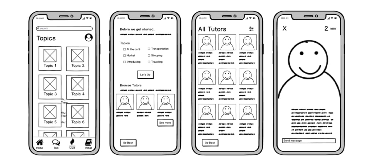
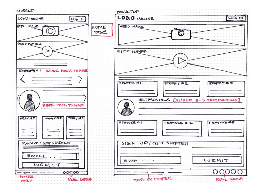
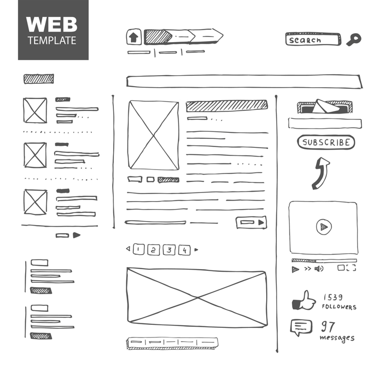
A great idea can be built into a website or app, but without thoughtful planning, even the best concept can fall flat. That's where wireframes come in. A wireframe is a visual guide of the content and functionality on a page, taking into account the user experience. It should be treated as a roadmap. It’s completely planned before starting a trip, it is referenced throughout the trip, and at the end, the final destination should look a lot like where the map was supposed to take you. Here are some examples of wireframes other people have drawn up before starting to build:
Things to consider as you wireframe:
- Which design principles are you using to make the page clear and easy to navigate?
- What does the mobile version look like first? How does it change on a larger screen?
- What color palette will you use? Write down your hex codes so you don't forget!
- Get feedback from someone who wasn't involved in your design process for their opinion!
Now it's your turn! Use everything you've learned in this lesson to revisit and improve your About Me site.
Practice | Iterate On Your About Me Page
Using this lesson’s design principles and the mobile-first design philosophy, update your existing About Me site. Review your current layout and identify areas to improve content grouping, spacing, and color contrast. Start by creating a quick wireframe on any platform you’d like (paper, Figma, Canva, etc.), then apply your changes to your website, and reflect on how they enhance the user experience!
🤖 AI Connection
Before opening an AI tool, sketch your wireframe and jot down 2-3 design changes you want to make and why. Then, prompt an AI tool to critique your site's layout for content grouping, spacing, or color contrast. Compare its suggestions to your own: What did you agree on? Where did you disagree?
For a summary of this lesson, check out the 5. Web Design One-Pager!